
Think Ugly. Mean Everything.
How to design with the fearless, question-everything methodology of Tibor Kalman: The man who weaponized bad taste and called it truth.

~~Design Thinking
DESIGN IS NOT DECORATION
4 min read·Design Methodology·March 2026

The Troublemaker
Who Changed Everything
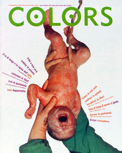
There are designers who make things look good. And then there was Tibor Kalman, a designer who made things mean something, even if it made you uncomfortable. Born in Budapest in 1949 and raised in New York, Kalman founded the legendary design studio M&Co in 1979, spent five formative years as Editor-in-Chief of Colors magazine for Benetton, and died of lymphoma in 1999 at just 49 (leaving behind a body of work that still makes designers flinch and think in equal measure).
He was not interested in beauty for beauty’s sake. He was interested in provocation with purpose. He designed restaurant menus that looked like passports, watches with no numbers, and magazine covers featuring world leaders with racially swapped skin tones. He believed design was a moral act, and he was not afraid to say so out loud, always in print, always with conviction.
“We’re in the communications business. But what are we communicating? I want to use design to ask questions, not give answers.”
— TIBOR KALMAN
~~STYLE & METHODOLOGY
Controlled Chaos as a Craft
Kalman’s visual language was deliberately unpolished, a radical stance in an industry obsessed with refinement. He embraced clashing typefaces, awkward cropping, raw photography, and layouts that violated every grid ever invented. But this was not incompetence. It was strategy. He called it “wrong design done right.” The aesthetic friction was the message.
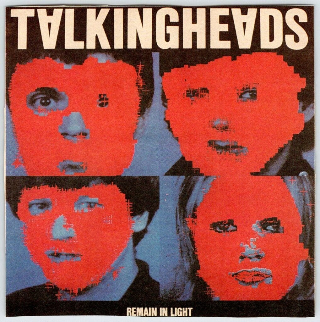
At M&Co, his studio designed for clients ranging from Florent restaurant to Talking Heads. Each project carried an unexpected conceptual twist: menus printed as newspapers, album covers that looked like ransom notes, clocks with their numerals scrambled backwards. Every piece asked the same question: what if we didn’t do what’s expected?
At Colors, he pushed even further. Under his direction, the magazine confronted AIDS, race, religion, war, and globalization with imagery that was equal parts journalism and provocation. The design was the argument. Layout choices carried political weight. Typography was deployed like a scalpel. His methodology can be distilled to one guiding principle: design begins with a dangerous question, not a client brief.
— ✦ —
INFLUENCE
Why the Industry Still
Owes Him
Kalman helped dismantle the idea that a designer’s job is to serve the client’s desire for beautiful, uncontroversial objects. He argued (loudly and in print) that designers are cultural producers with ethical responsibilities. This was not a popular stance in boardrooms. It remains radical today.
His influence threads through contemporary design culture in ways both obvious and invisible: the rise of critical design, the editorial aggression of publications like Emigre, the unapologetic visual identity of studios that operate more like editorial voices than service providers. When a brand today takes a political stance through design, Kalman helped make that possible, and he would have questioned whether it was enough.
He also changed how designers talk about their work. He made it acceptable (necessary, even) to ask whether your design was making the world better or just making a client richer. That question is uncomfortable. He intended it to be.
( ( ( ••••***~THE METHOD ⭐️
5 Steps to Design Like Tibor Kalman
You don’t have to replicate his aesthetics. You have to replicate his thinking.
1-Ask the Uncomfortable Question First
Before you open a file, ask what the brief is really asking you to do — and whether it should be done at all. Kalman famously refused work he found dishonest. At minimum, find the contradiction or the tension inside the project. Design that ignores contradiction produces decoration. Design that confronts it produces meaning.
2-Use “Wrong” as a Tool
List every rule that applies to your project (typographic, compositional, conceptual) and deliberately break the most important one. Not for shock value, but to see what truth lives in the violation. The expected solution is often the invisible one. Wrongness creates friction. Friction creates attention. Attention is where meaning begins.
3-Let the Concept Drive Every Decision
Every typeface, every color, every piece of white space should be defensible by the central idea; not by taste, trend, or client preference. Kalman didn’t choose a font because it looked good. He chose it because it was the right weapon for the argument. If you can’t explain why a visual decision exists conceptually, it doesn’t belong there.
4-Design for Culture, Not Just the Client
Every designed object enters public space and influences how people think. Treat your work that way. Ask who else encounters it beyond the target audience. Ask what values it quietly reinforces. This doesn’t mean every project needs to be political; it means every project should be conscious. Unconscious design is how culture gets uglier without anyone noticing.
5-Reject Refinement as a Default
Kalman’s work often looked unfinished by intention, because polish, unchecked, becomes dishonesty. It smooths over the rough edges of an idea that needed to stay rough. Practice making something that communicates powerfully without being beautiful. Then ask why you needed beauty in the first place. The answer, if you’re honest with it, will make your refined work better too.
FINAL WORD
Tibor Kalman spent his career insisting that design is never neutral; that every choice, every surface, every typeface either questions the world or quietly endorses it. His challenge to us is not to work the way he worked. It is to want what he wanted: work that is honest enough to be uncomfortable, and brave enough to mean something. In a field increasingly driven by systems, scalability, and satisfaction scores, that is still (maybe more than ever) a radical act.